【Localizing Web Contents For Japan】Strategy That Have Doubled The Effectiveness

When creating a Japanese website, are you just translating the text from your multilingual website?
Actually, rethinking and localizing your brand design for the target country is more important than SEO when creating a multilingual site.
We will show you why brand localization is so important, including sharing our own success stories.
This is how we doubled the effectiveness of our client’s Japanese website when expanding it into multiple languages. This may be a useful reference for your Japanese site.
Localizing Your Brand When Creating a Multilingual Website
Localization is the process of making a software or program available in other languages based on the country or region (local) not from the country where it was created.
When we provide assistance for a brand or service in developing its website overseas, or when we create a multilingual website, we take the step of rebranding it to a design that is familiar to the country where the content will be distributed, and making it blend well in the target country.
We call this step “brand localization”.
After attracting users to your site through SEO, we use targeted branding to capture their attention and reduce the number of users who leave the website.
Why Do We Need To Fix Our Brand?
Every Country and Region Has Its Unique Design Sense
Different countries have different standards for what is considered good design, and different senses of design, including a sense of color.
Depending on the region and cultural background, colors and icons (shapes) can have different meanings.
For example, the thumbs-up gesture known as “like” on Facebook is not always used in a positive sense in some regions, and in some countries it is even used to insult others. When developing a multilingual website, it is absolutely necessary to research the design sense of the target country.
Design Is What Creates a Sense of Familiarity
Psychologically, it is said that it is easy to become close to people who share similar values, upbringing, and experiences.
In the same way, if you can make your visitors feel that you have the same culture and values, they will feel closer to you.
Culture and values can be expressed in the design, which is the element that determines the impression of the site.
The Interrelationship Between the Sense of Familiarity and Conversion Rate
By localizing your brand to match the culture of the target country and creating a “design that is close to the culture of the viewer,” the viewer will feel a sense of familiarity and will be psychologically more likely to make contact (talk to you).
As a result, it will lead to higher conversion rates such as inquiries.
On the other hand, if you only translate the text for your multilingual site and fail to provide a visual identity suitable for the target audience, users will not be interested in the content and may leave the site.
How Is Web Design Different In Japan As Compared To Overseas?
Crammed Japanese Design
The Rakuten Ichiba shopping site is one of the most famous examples of “Japanese web design”.
Rakuten Marketplace Top Page
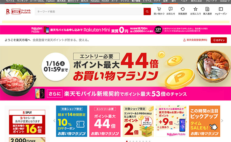
Banners and texts are laid out without gaps, and each banner design is emphasized.
Personally, I find it fun to shop while looking at various products, so I think this design is fine if it is developed for the Japanese market.
However, to the eyes of Westerners, such different colors and texts seem to clash and seem unusual.
Although it is not web design, the scramble crossings in Shibuya and the neon streets of Shinjuku with their many billboards are very unusual to foreign tourists and have become tourist attractions.
In the airline and tourism industries, images of neon streets are often used as marketing images to encourage people to visit Japan. It is such a rare sight for Westerners.
Overly Polite Warning Signs
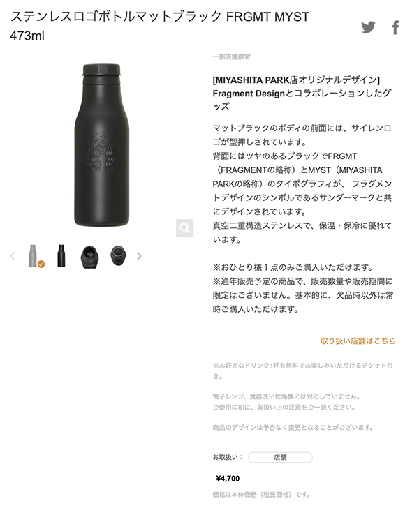
Another characteristic of Japanese web design is “overly polite warnings”.
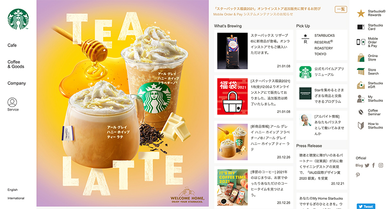
We often see a lot of warning signs in small letters to make the site more polite and friendly, and to avoid complaints.
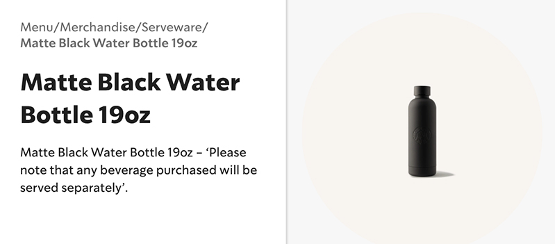
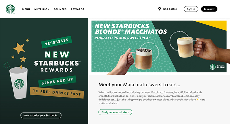
In contrast, in most Western websites, when separate information is required, such as food allergy information, it is either linked to a separate page or hidden in the initial display with an accordion-type UI.
Product Page of Starbucks in Japan
Product Page of Starbucks in Europe
Simple Web Design In The West
Let’s take a Dutch shopping site as an example.
It is a large general shopping site like Rakuten Marketplace, with a vast number and wide selection of products, but the colors are uniform and the impression is clean and clear.
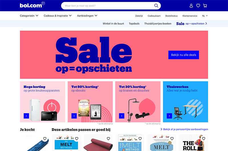
Particularly Large Differences between East Asia and Europe
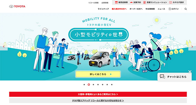
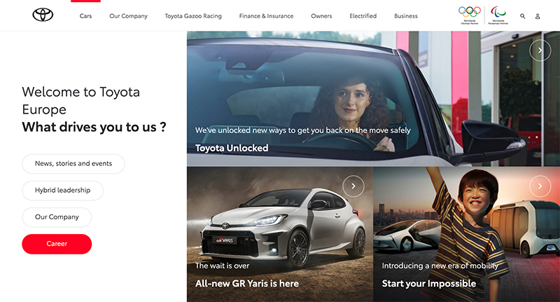
Each country has a slightly different design characteristics and preferences, but East Asia, including Japan, and Europe and the United States have particularly large differences and are said to be polar opposites.
Characteristics of Japanese Web Design
| Impression | Complex, Lively |
| Photos | Multiple small images |
| Texts | Detailed information and notes on the website |
| Color | Colorful with multiple color schemes |
Characteristics of Western Web Design
| Impression | Simple and clean |
| Photos | One large main image |
| Texts | Use short and concise copy and minimize the use of text |
| Color | Use a small number of colors, no more than two at most |
Examples of Design Localization for Famous Companies
Starbucks
Toyota Motor Corporation
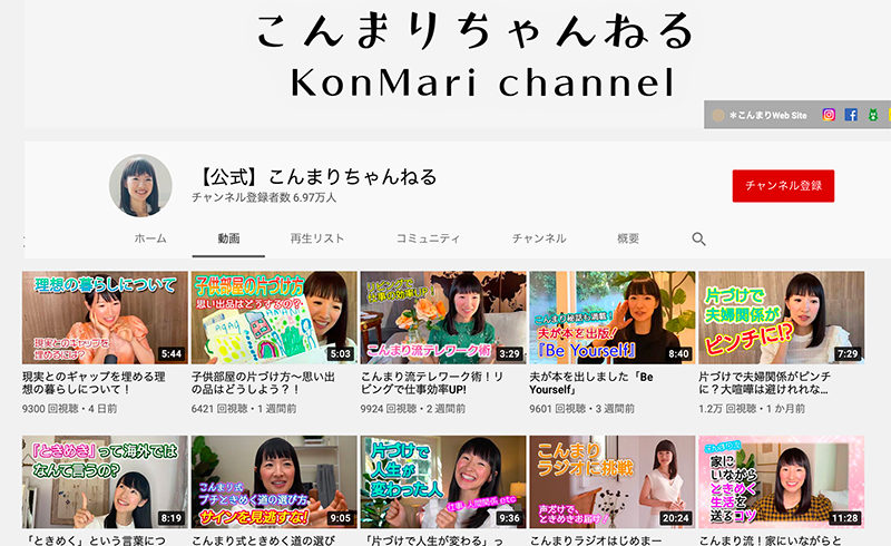
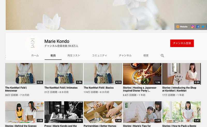
Extra Credit: Branding by Marie Kondo a.k.a “KonMari”
Ms. Marie Kondo, who became famous worldwide through Netflix, also has a different branding image in Japan and overseas.
Why Do We Have Different Design Preferences?
Cultural Differences
Japan has a culture of “not wasting space” and prefers to squeeze in elements to efficiently fill all available space.
In Europe, colorful color schemes using three or more colors and pop fonts, which are used in sites for children, are often used in sites for adults as well, as “cuteness” is accepted by adults as typified by Japan’s “Kawaii” culture.
On the other hand, in the West, the idea of being succint is preferred, and a “less is more” approach is preferred.
Being exposed to art from a young age, we are accustomed to a more sophisticated atmosphere. There is also a tendency to think that children’s pop designs are only for children.
There is also a strong awareness of the need to keep the space clean and tidy, and during the lockdown caused by the coronavirus epidemic, flower stores were allowed to remain open while “non-essential” stores were banned.
A Successful Case Study of a Multilingual Website That Doubled The Response Rate
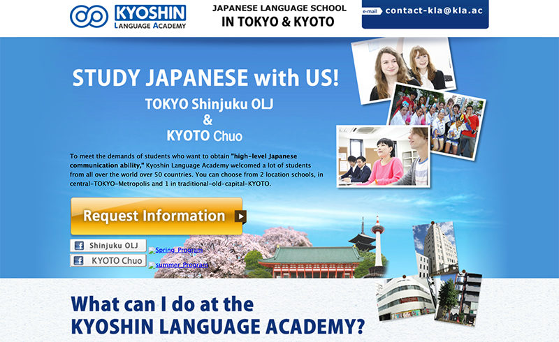
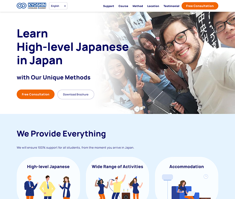
We redesigned the landing page of a multilingual website targeting European customers. In addition to listing and other measures, the number of inquiries doubled as a result of changing the design to a simple one that our target European viewers are used to seeing.
Some of the Measures Taken
1. Simplify the First View

Before the redesign, there were many design elements in the first view, and the points we wanted to emphasize were not prominent.

We took a cue from the design often seen in LPs from the target country and made the catchphrase large and concise.
2. Reduce the Amount of Visual Text
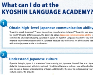
Before the redesign, the design seemed to be packed with text, and it was necessary for a user to read carefully in order to understand the content.
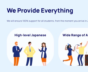
We decided that users in the target country would not be familiar with a text-centered structure, so we made it easier for them to grasp the overall outline by creating a clearer distinction between the text and the parts to be read.
Conclusion
We can create a multilingual website that will capture the hearts and minds of the target audience from different cultures and lead to successful results by approaching the target country’s culture through the design, rather than just translating the text into multiple languages with the branding preferred in Japan.
Our multilingual website production and consulting services can help companies expand their business overseas, including rebuilding their brand image.
Please feel free to contact us.
